

Tight Deadlines? 5 Quick Presentation Solutions
Explore efficient tools and techniques to create polished presentations quickly, ensuring clarity and professionalism under tight deadlines.
Oct 24, 2025

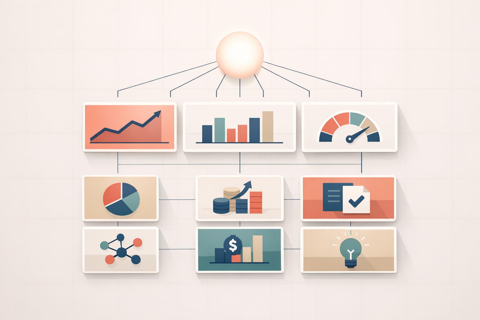
When you're up against the clock to create a professional presentation, the right tools can save the day. Here's how to cut through the chaos and deliver high-quality results:
AI-Generated Content: Use AI tools to quickly analyze data, create structured insights, and export polished slides.
Pre-Built Templates: Start with professional templates tailored for business needs, reducing design time.
Automated Visuals: Turn raw data into clean, ready-to-use charts and graphs in seconds.
Design Automation: Let AI refine layouts, fonts, and formatting for a professional finish.
Brand & Accessibility Checks: Ensure presentations align with corporate standards and are accessible to all.
These solutions streamline the process, allowing you to focus on delivering a clear and impactful message without sacrificing quality.
Quick Presentation Skills Tips That Everyone Can Use: Tip 7- Don’t Get Lost in the Weeds
AI-Generated Business Briefs with Instant Export
When you're racing against the clock, AI-powered strategic planning platforms can be a game-changer. Instead of starting from scratch, these tools generate structured, well-organized narratives in minutes, using tried-and-true business frameworks. The result? Presentations with the analytical depth and precision that executives demand - without the marathon hours of manual research.
AI doesn’t just save time; it delivers depth. Tasks that once required a team of analysts burning the midnight oil can now be handled by one person in the span of a coffee break. While the AI takes care of data synthesis and preliminary analysis, you can concentrate on honing strategic insights and tailoring the message to your audience.
Automated Research and Analysis
AI-powered tools eliminate the bottlenecks of manual research by processing massive amounts of business data in seconds, turning it into actionable insights.
These platforms use established frameworks like SWOT analysis, Porter's Five Forces, or Blue Ocean Strategy to address your specific business challenges. Instead of spending hours gathering data on market conditions or competitors, the AI organizes and synthesizes this information automatically, presenting it in a structured and logical format.
What’s more, these systems can uncover patterns and connections that might take human analysts hours - or even days - to identify, especially under tight deadlines. This means your presentation isn’t just faster to produce; it’s often more thorough and insightful than what you could achieve manually in the same amount of time.
For consultants and executives juggling multiple clients or projects, this automation transforms the way strategic work gets done. You can tackle complex problems without sacrificing either speed or analytical rigor. Once the analysis is set, you can quickly move on to translating those insights into polished, boardroom-ready presentations.
Export to Professional Formats
After the analysis is complete, exporting your work into professional formats is seamless. Advanced platforms allow instant export to PowerPoint, PDF, and other standard formats, complete with polished slide layouts, clean typography, and visuals that meet corporate presentation standards.
These exports aren’t just text-heavy documents - they include charts and graphs that transform raw data into visually compelling insights. This eliminates the time-consuming task of manually creating visualizations. Plus, the formatting adheres to conventional business structures, featuring executive summaries, detailed data visualizations, and clear action points.
For professionals working across various industries or catering to specific client needs, these export tools also offer customization options. You can adjust branding and formatting to align with corporate or client-specific standards, ensuring consistency without adding extra design work.
Pre-Built Professional Presentation Templates
When you're racing against the clock, having access to ready-made presentation templates can be a lifesaver. These templates not only save time but also ensure your presentation maintains the polished, professional look that business audiences expect. By using pre-built templates, you can focus entirely on crafting your message without getting bogged down in design details.
Modern template libraries offer thousands of options tailored for business needs - whether you're preparing an investor pitch, a quarterly review, or a strategic planning session.
"Presentation decks can make or break your speech - don't risk boring or unprofessional slides distracting from your message. Set yourself up for success with free, eye-catching presentation templates that don't require graphic design skills to use." - Microsoft Create [1]
The efficiency these templates provide is undeniable. What might take hours of design work can be completed in minutes with minimal tweaks. Up next, let’s dive into how these templates allow for detailed customization, so you can tailor them to fit your specific business needs.
Customizable Templates for Business Use
Professional templates serve as flexible starting points, designed to adapt to your unique requirements. As of 2025, platforms like Canva offer nearly 20,000 business presentation templates, covering everything from product pitches to annual performance reviews [5]. These templates can be easily personalized with your company’s branding - colors, fonts, and even pre-built charts - to create a cohesive and professional presentation. Plus, they can be exported into multiple formats like PowerPoint, PDF, or MP4 video files.
Customization is simple yet powerful. These templates are fully editable, allowing you to tweak everything from colors and fonts to icons, shapes, and placeholder text to match your brand’s identity [6]. SlideModel, for instance, offers over 467 business PowerPoint templates that cater to key topics like market analysis, financial modeling, and strategic planning [6]. They are compatible with Microsoft PowerPoint, Google Slides, Office 365, and Keynote, ensuring seamless integration into your workflow.
One of the standout features of these templates is the built-in business structure they provide. They follow tried-and-true frameworks - executive summaries, problem-solution outlines, and action plans - ensuring your presentation flows logically and resonates with your audience. Additionally, templates designed for U.S. audiences meet local formatting standards, making them an excellent choice for American business settings.
Standard Formats for U.S. Business Audiences
Templates tailored for U.S. business use automatically incorporate local formatting conventions, such as MM/DD/YYYY for dates, $1,000.00 for currency, and imperial measurements. These details ensure that your presentation aligns with what American audiences are accustomed to.
To accommodate various display devices, templates are available in both 4:3 and 16:9 aspect ratios. This flexibility ensures compatibility with everything from older projectors and iPads to modern laptops and widescreen monitors [2][3]. As The Presentation Company explains:
"Widescreen templates and standard templates are built differently in PowerPoint: you must construct each new presentation in either standard or widescreen – but not both." - The Presentation Company [2]
Many professional templates also incorporate proven design principles, such as the 7-7-7 rule - limiting slides to 7 lines, 7 words per line, and a maximum of 7 slides. This approach helps prevent information overload, making your presentation more engaging and easier to follow [4].
For U.S.-focused presentations, these templates also include consistent design elements and pre-built layouts for infographics, ensuring that financial data and performance metrics are presented in a way that American executives find clear and reliable [7].
Automated Data Charts and Executive Summaries
When deadlines are looming, creating charts and summarizing complex data manually can eat up hours you don’t have. AI-powered tools eliminate this hassle, turning raw datasets into polished visuals and concise summaries in just minutes - giving executives the insights they need without delay.
AI automation simplifies data visualization by quickly identifying patterns and presenting them in formats that resonate with decision-makers. Instead of spending hours tweaking Excel charts or fiddling with design software, these tools analyze your data and automatically generate the best chart types - whether it’s a bar graph for comparisons, a line chart for trends, or a pie chart to break down market share.
Converting Raw Data into Visual Charts
AI-driven tools take the guesswork out of data visualization. They analyze your raw data and suggest the most effective chart types to communicate your message. For example, quarterly sales data might be presented as a combination of line charts to show trends over time and bar charts to compare performance across products or regions.
But it doesn’t stop at just creating charts. These tools ensure your visuals are polished and professional, applying consistent color schemes, proper scaling, and clear labels. They even adapt to U.S. business conventions - showing temperatures in Fahrenheit, distances in miles, and weights in pounds - so your presentation speaks directly to an American audience.
The time savings are huge. What used to take hours can now be done in seconds. Simply upload your dataset, and the AI generates multiple visualization options. You can then choose the format that best suits your audience and goals. Once the visuals are ready, AI tools also make crafting executive summaries a breeze.
Creating Clear Executive Summaries
Executive summaries need to be sharp, concise, and straight to the point - qualities AI excels at delivering, even under tight deadlines. These tools process lengthy reports, market research, or financial data and extract the most critical insights, presenting them in a format tailored for decision-makers.
AI tools follow a structure that executives expect: key findings upfront, followed by supporting data, and ending with actionable recommendations. Using proven business frameworks, the summaries are organized for clarity, making it easier for leaders to act quickly.
What sets modern AI apart is its contextual understanding. It recognizes industry-specific terms, grasps the importance of financial metrics, and prioritizes information based on its business impact. For example, when summarizing a market analysis, the AI highlights competitive threats, growth opportunities, and revenue potential, while less critical details are placed in supporting sections.
The language optimization feature ensures the summary is written in a direct, results-driven tone that resonates with senior leaders. It simplifies technical jargon into clear, actionable language without losing precision. Numbers, percentages, and dates are formatted to U.S. standards, making the information easy to digest.
Executives appreciate how AI tools can prioritize recommendations and outline resource requirements. This turns your presentation into more than just a data report - it becomes a strategic roadmap leaders can act on immediately.
Fast Design Fixes for Professional Results
When you're racing against the clock, spending hours fine-tuning fonts or adjusting margins is simply not an option. Thankfully, modern design automation tools can handle these tedious tasks for you, transforming your rough slides into polished, presentation-ready materials in no time.
These AI-powered tools apply essential design principles to your slides automatically, ensuring they meet professional standards without requiring a design background. The result? A visually consistent and attention-grabbing presentation that's ready to impress in any boardroom. Plus, this automated groundwork sets the stage for more advanced formatting and compliance checks.
Using Auto-Formatting and Layout Tools
Think of auto-formatting tools as your on-demand design assistant. With just a few clicks, they apply consistent styles across your entire presentation. Fonts, spacing, alignment, and colors are optimized automatically, giving your slides a clean, cohesive look.
These tools also use AI to refine layouts for readability and balance. For content-heavy slides, they ensure text is easy to read. For data-focused slides, they emphasize key metrics without overwhelming the audience. Even image-heavy presentations benefit from professional cropping and positioning to maintain a smooth visual flow.
Here’s where these tools excel: consistency enforcement. They make sure every slide sticks to the same font styles, margins, and color schemes, creating a polished, unified design.
Another standout feature is intelligent spacing. These algorithms adjust white space around key elements, preventing clutter and making even last-minute additions look intentional. They also balance text-to-image ratios, ensuring your slides are both scannable and visually appealing.
Need to adapt existing content? Template adaptation features can reformat bullet points, financial data, or frameworks to match professional design standards. The tools recognize content patterns and apply the right visual treatments automatically, saving you time and effort.
Brand Compliance and Accessibility Checks
Once your slides are formatted, advanced compliance tools step in to ensure they align with corporate brand guidelines and remain accessible to all audiences. These AI-driven systems scan your presentation, flagging issues and offering one-click fixes to bring everything in line.
Brand compliance is handled seamlessly. Approved color palettes, font families, logo usage, and text sizing are checked and adjusted as you work, ensuring your presentation maintains a professional and on-brand appearance.
For accessibility, color contrast optimization ensures text and background combinations meet WCAG standards, making your slides easier to read for everyone, including those with visual impairments. These adjustments enhance accessibility without sacrificing visual appeal.
Layout accessibility features take inclusivity a step further by optimizing slides for screen readers and assistive technologies. This includes adding proper heading structures, meaningful alt text for images, and logical reading orders for slide elements. While these might seem like minor details, they show a commitment to professionalism and inclusivity.
Finally, export optimization ensures your presentation looks great in any format. Whether it’s being viewed on a laptop, large monitor, or as printed handouts, these tools adjust resolution, layout, and sizing for the best possible display.
Before you hit "send" or step into the meeting, a final compliance sweep catches any lingering issues. It reviews brand standards, accessibility requirements, and formatting to ensure your presentation meets the high expectations of business environments. With this final check, you can feel confident that even a rushed project will look polished and professional.
Summary of 5 Quick Solutions
When time is tight and deadlines are looming, these five presentation tools can bring order to the chaos and save the day. AI-generated business briefs take on the time-consuming tasks of research and analysis, effortlessly compiling market insights that once required days of effort. Pre-built professional templates remove the hassle of formatting, giving you a polished starting point tailored for U.S. business audiences.
The efficiency doesn’t stop there. Automated data visualization transforms raw numbers into clear, concise charts and summaries, while auto-formatting tools ensure your designs stay polished and aligned with brand standards. These features keep your presentations looking sharp and professional, even under pressure.
In today’s fast-paced business world, strategic planning requires both speed and precision. Tools like StratEngineAI combine these strengths into a seamless workflow, turning complex business challenges into polished, boardroom-ready presentations. What used to take weeks can now be accomplished in minutes, freeing you to focus on delivering impactful strategic insights. Whether it’s a last-minute client request or an urgent board meeting, having the right tools can mean the difference between a rushed, lackluster presentation and one that leaves a lasting impression.
FAQs
How can AI tools help me create high-quality business presentations when I’m short on time?
AI tools take the hassle out of building professional presentations by automating tedious tasks like designing slides, summarizing information, and creating visuals. This means you can devote more energy to delivering a clear and impactful message, even when you're racing against the clock.
On top of that, AI can break down complex data, spotlight crucial insights, and ensure your visuals stay consistent. The result? Presentations that are not only polished but also easier for your audience to follow. These tools let you create impressive, engaging presentations faster - without compromising on quality.
What are the benefits of using pre-designed templates for business presentations, and how flexible are they for customization?
Using pre-designed templates for business presentations comes with some clear perks. For starters, they save you loads of time by giving you a ready-to-use framework. Plus, they help your slides look polished and professional, which is key when you’re trying to make a strong impression. Another bonus? They keep your branding and design consistent, which is a lifesaver when you’re juggling tight deadlines.
What’s even better is that most templates are incredibly flexible. You can tweak colors, switch up fonts, rearrange layouts, and even add your own images or logos. This means you can easily adapt the design to fit your business's branding and unique needs while keeping everything looking sharp and cohesive.
How do automated data visualization tools make my presentation charts accurate and visually appealing?
Automated data visualization tools bring precision to the table by leveraging AI to process data and create accurate charts, minimizing the chances of human error. They’re built to determine the most effective ways to present your data, ensuring it’s both clear and dependable.
These tools also focus on aesthetics by following established design principles. From picking the most suitable chart types to maintaining a logical hierarchy and using harmonious color schemes, they ensure your visuals are not just accurate but also visually appealing. The result? Data that's easier to understand and more compelling for your audience.