Your presentation design can make or break how your message is received. Whether pitching to investors, sharing business updates, or proposing new ideas, well-designed slides help you communicate clearly and leave a lasting impression. Here's what you need to know:
- Why Design Matters: Companies with polished presentations secure funding 67% more often and close deals 43% more successfully. Clear visuals also improve audience understanding by 89%.
- Core Tips: Focus on one idea per slide, use visuals over text, and maintain consistent design.
- AI Tools: Tools like PowerPoint Designer and Canva simplify design, ensuring professional layouts, consistent styles, and optimized content in minutes.
- Trends to Watch: Minimalist designs, dark mode themes, and interactive elements are reshaping how presentations engage audiences.
A great presentation isn't just about aesthetics - it's a tool for influence. By mastering layout, colors, typography, and visuals, and leveraging AI tools, you can create slides that command attention and drive action.
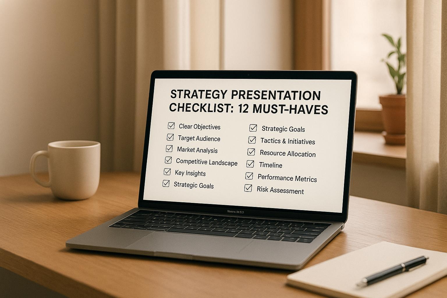
13 Presentation Design Tips to Create an Awesome Slide Deck
Core Elements of Professional Presentation Design
Creating a strong presentation starts with a few key principles that ensure clarity and leave a lasting impression. These principles include keeping each slide focused on a single idea, using visuals to amplify your message, and maintaining a consistent design throughout.
Layout Design
The golden rule of presentation design is this: one slide, one idea. Overloading a slide with too much information can overwhelm the audience, while a focused approach keeps your message clear and easy to follow [1][3]. Each slide should center around a single concept or goal, transforming what might otherwise be cluttered into something clean and engaging.
Visuals play a crucial role here - graphics often convey your point more effectively than text-heavy slides ever could [1][2]. Combine this with a consistent design style, and you’ll create a presentation that not only looks polished but also feels cohesive and professional.
Next, let’s dive into how thoughtful color schemes can bring these design principles to life.
Using AI-Powered Tools for Presentation Design
AI is transforming how we create presentations, making it easier to design polished, engaging slides while allowing you to focus on your core message. These tools take care of the technical design work, freeing you up to fine-tune your content and connect with your audience. It’s a shift that lets you spend more time crafting a compelling narrative and less time wrestling with design details.
Benefits of AI Tools
AI design tools are a game-changer for anyone tired of spending hours on tedious tasks like adjusting layouts, fonts, or colors. These tools streamline the process, using established design principles to produce visually appealing slides in seconds.
One of the biggest advantages is saving time. What used to take hours can now be done in minutes. AI analyzes your content and suggests layouts that improve readability while keeping things visually engaging. This means you can invest more energy into perfecting your delivery and refining your message.
Another key benefit is design consistency. AI ensures that fonts, colors, and spacing remain uniform across all slides, even when multiple contributors are involved. This creates a cohesive and professional look, with AI acting as a safeguard for your brand’s style guidelines.
Content optimization is another area where AI shines. These tools can recommend replacing text-heavy slides with charts or visuals, suggest better color combinations for improved accessibility, and flag slides that might be overloaded with information. The result? Slides that communicate your ideas more effectively and resonate with your audience.
Overview of AI Design Tools
Today’s presentation software is packed with AI features that simplify every step of the design process. For example, PowerPoint Designer, a built-in feature in Microsoft’s presentation software, automatically analyzes your content and offers professional layout suggestions. Add an image or key data points, and it generates multiple design options to transform a plain slide into something visually compelling.
Canva's AI tools take things a step further, offering personalized design suggestions tailored to your industry and presentation type. Its Magic Resize feature adjusts your slides for different formats - whether you’re presenting on a large screen or sharing a mobile-friendly version for remote viewers.
If you’re working with data, these tools make it easy to create clear, impactful visuals. Instead of struggling with formatting, you can upload your spreadsheet data, and the AI will generate professional charts and infographics that highlight key trends and insights.
AI also brings template intelligence to the table, suggesting layouts based on your content and audience. For instance, a financial report will receive different design recommendations than a creative pitch, ensuring the visuals align with audience expectations. Over time, these tools learn from your preferences, tailoring future suggestions to match your style and branding - like having a personal design assistant at your fingertips.
Next, we’ll dive into current trends that are shaping the future of professional presentation design.
sbb-itb-7250072
Current Trends in Professional Presentation Design
The world of presentation design is shifting rapidly, with a strong focus on grabbing attention and delivering content through visually engaging formats.
Minimalist and Bold Designs
The principle of "less is more" has become a cornerstone of modern presentation design. Clean layouts with plenty of white space are paired with bold elements to create a striking, uncluttered look. By focusing on one key message per slide, presenters ensure their content is both impactful and easy to digest.
Bold typography and carefully chosen accent colors help emphasize critical points, making it easier for busy professionals to absorb the main ideas quickly. This approach is especially effective in fast-paced settings where decision-makers need to process information efficiently.
Even data-heavy content benefits from this minimalist trend. Instead of overwhelming audiences with dense spreadsheets or overly detailed charts, designers are opting for simplified visuals that highlight key insights. A single, well-crafted graph with clear labels often communicates more effectively than multiple complex diagrams.
When it comes to color palettes, keeping things simple is key. Most minimalist designs stick to two or three complementary colors, creating a polished, cohesive look that ensures the content remains the star of the show.
Dark Mode Slides
Dark mode is no longer just a feature for apps and devices - it’s making waves in presentation design too, especially in tech and creative fields. Beyond its sleek, modern aesthetic, dark mode offers practical benefits, such as reducing eye strain during lengthy presentations in dimly lit rooms.
This high-contrast style enhances readability and gives presentations a professional edge, making it a favorite for executive meetings and large-scale events. Bright accent colors and visuals pop against dark backgrounds, drawing attention to key content. However, it’s worth noting that dark mode works best in controlled lighting environments. In bright or outdoor settings, lighter backgrounds may still be the better choice.
Interactive and Dynamic Elements
Interactive presentations are reshaping how audiences engage with content. With 73% of people admitting to multitasking during traditional presentations [5], it’s clear that capturing attention requires a more dynamic approach.
Interactive elements transform passive slides into engaging experiences. For example, live polls and real-time surveys allow presenters to gather feedback instantly, making their message more relevant and adaptable. Clickable navigation features let viewers explore topics that interest them most, creating a personalized experience ideal for training sessions or educational materials.
Dynamic visuals, such as animations, bring data to life in ways static charts simply can’t. This added movement helps audiences better understand trends and improves retention - studies show that pairing content with sound effects enhances recall by 50% [5].
Gamification is another growing trend in presentation design. Incorporating game-like elements has proven to boost productivity, with 80% of learners reporting increased engagement when tasks include gamified features [4]. This shift aligns with broader preferences, particularly among millennials, 78% of whom value live experiences over physical goods [4].
These trends are paving the way for more engaging and effective presentations, helping professionals communicate their insights in ways that resonate with today’s audiences. By embracing these design shifts, presenters can ensure their message not only reaches but also sticks with their audience.
Business Applications of Presentation Design
Professional presentation design goes beyond just making slides look good. In today’s fast-paced business world, a well-designed presentation is a powerful tool - it can help drive critical decisions, secure funding, and align teams on complex projects. The way a presentation is structured and visually communicated can determine whether a proposal gets the green light or is left on the back burner.
Communicating Business Plans Effectively
A poorly presented business plan can fail to make an impact, no matter how strong the strategy behind it. That’s why turning complex ideas into clear, actionable visuals is so important.
Start by establishing a clear visual hierarchy. Begin with the key strategic objectives, then back them up with data to create a story that guides your audience. This approach is especially crucial when addressing C-suite executives who need to quickly understand and act on the information.
Color coding is a game-changer when dealing with multi-layered business plans. Assign specific colors to represent business units, time periods, or performance metrics, and stick to this system throughout the presentation. This consistency makes it easier for your audience to follow relationships between different elements without getting overwhelmed.
Data visualization is another critical component. Instead of overwhelming your audience with raw spreadsheets, focus on creating clean charts and graphs that highlight trends and opportunities. For instance, a well-designed dashboard slide can summarize quarterly performance across various divisions far more effectively than pages of numbers.
Typography also plays a key role in how your message is received. Use bold, sans-serif fonts for headings to ensure text is easy to read, even in large meeting rooms. Keep font sizes consistent for similar types of information to signal professionalism and maintain audience attention on the content, not the formatting.
Using StratEngineAI for Business Presentations
StratEngineAI is reshaping the way business presentations are created, combining speed with precision. In today’s strategic planning landscape, where time is often limited, this AI-powered tool can create polished presentations in a fraction of the time it would take manually. Instead of spending weeks compiling market research and competitive analysis, StratEngineAI generates complete strategic briefs tailored for executive-level presentations.
The AI organizes content using trusted frameworks like SWOT, Porter’s Five Forces, or Blue Ocean Strategy. Upload a business challenge, and StratEngineAI structures the analysis in a way that’s logical and easy for executives to grasp. This ensures your presentation aligns with the formats decision-makers are accustomed to seeing.
What used to take weeks can now be done in minutes, without sacrificing depth. StratEngineAI produces market insights, competitor analysis, and actionable recommendations, all ready to be exported as professional-grade slides. This speed is invaluable when preparing for urgent meetings or addressing unexpected challenges.
Consistency is another major advantage. StratEngineAI ensures every presentation adheres to professional standards, maintaining the same level of analytical rigor and visual quality regardless of who creates it. This reliability builds trust with executive audiences, who come to expect a certain standard in your strategic communications.
The tool’s instant export feature also eliminates the tedious task of formatting slides. Analysts can focus on interpreting data and crafting strategic insights, while the AI takes care of applying professional design elements that meet boardroom expectations.
For consulting firms and internal strategy teams, this capability represents a shift in how strategic work is packaged and delivered. The ability to quickly create scenario analyses or compare strategies through polished presentations enables more dynamic discussions and faster decision-making, giving teams a competitive edge in a high-stakes environment.
Conclusion
Creating a professional presentation isn't just about putting slides together - it's a powerful tool to influence decisions and secure buy-in. The difference between an average presentation and one that truly stands out can determine whether your ideas gain traction or fade into the background.
By mastering key design elements like layout, color, typography, and data visualization, you can capture attention and establish credibility. When these elements are thoughtfully executed, your audience focuses on your message, not on deciphering poorly designed visuals.
With the integration of AI technology, designing impactful presentations has become faster and more efficient. AI-powered tools now handle time-consuming design tasks, turning hours of effort into minutes of polished, high-quality results. These tools allow you to focus on crafting a strategic narrative that resonates with decision-makers, rather than getting bogged down in formatting. From generating structured briefs to exporting professional-grade slides, AI tools help you deliver presentations that meet the highest standards.
Current design trends, like minimalist layouts, dark mode themes, and interactive features, reflect modern preferences for clean, focused presentations. Audiences today expect concise, visually appealing slides that convey depth without unnecessary clutter - perfect for informed decision-making in fast-paced environments.
Every presentation is an opportunity to showcase your ideas and professionalism. Whether you're presenting quarterly reports, pitching a new product, or sharing strategic insights, your design choices will shape how your message is received. Start by focusing on one or two areas for immediate improvement - maybe refining your color palette or enhancing your data visuals. As you grow more confident, explore how AI tools can streamline your process while maintaining the quality your audience expects.
In a world where attention is fleeting and decisions are made quickly, a well-designed presentation can set you apart. By honing your design skills and embracing the latest tools, you'll ensure your message not only gets heard but also drives action.
FAQs
How do AI tools make creating professional presentations easier?
AI tools make crafting professional presentations easier by taking care of tasks like slide layouts, formatting, and visual tweaks. Features such as smart templates and design suggestions transform even simple ideas or prompts into polished, eye-catching slides in no time.
They also save you hours by providing predesigned themes, cohesive color schemes, and customizable templates. This means your presentation will look professional without needing advanced design skills or spending time on tedious manual adjustments. By handling repetitive work, AI frees you up to focus on creating meaningful content that connects with your audience.
What are the advantages of using minimalist and bold designs in professional presentations?
Minimalist designs paired with bold elements in professional presentations create a clear and focused experience for the audience. By stripping away distractions, this style ensures that attention is directed to the core ideas, making even complex concepts easier to grasp and recall.
Incorporating bold touches - like eye-catching visuals or striking typography - allows key messages to stand out. These choices not only draw the audience in but also leave a memorable impression. The result? A presentation that’s both visually engaging and highly effective in delivering its message.
How can interactive elements make presentations more engaging for the audience?
Interactive elements can turn a plain presentation into an engaging experience by inviting the audience to actively participate. Tools like clickable links, live polls, embedded surveys, interactive charts, and real-time Q&A sessions allow your audience to connect directly with your content.
These features do more than just add flair - they help maintain focus and keep the audience invested in your message. By encouraging interaction, you create a more memorable experience that not only boosts understanding but also ensures your key points stick with the audience.